


Choose a washed graphic tee by the finish you can actually see, the graphic contrast, and the way the shoulders and hem sit on your body. A faded surface adds character, but it does not prove heavyweight fabric, a soft hand, or a good fit—judge those separately.
- Choose a washed graphic tee for its visible finish, then check silhouette and graphic placement separately.
- 7WXVES suits readers drawn to washed cotton graphic tees with oversized, boxy fits.
- A faded graphic and faded fabric are different choices; decide which should carry the outfit.
- For oversized T-shirts, compare garment measurements rather than relying on the size label.
How do you choose a washed graphic tee with character?
Start with the relationship between the fabric and the print. Decide whether you want the graphic to stand out against the wash or become part of it. Then check the shape: shoulder placement, body width, sleeve opening, and length.
The 7WXVES product descriptions include washed cotton, oversized fits, and boxy silhouettes. Those are separate attributes. A wash describes the finish; oversized describes room; boxy describes shape. Choose the combination, not just the adjective.
Use this comparison when looking at product photographs. These are visual directions, not standardized manufacturing categories.
| Visual direction | Best for | What works | What to watch |
|---|---|---|---|
| Even fade | A quieter everyday outfit | Keeps attention on silhouette and graphic placement | Offers less visible variation across the fabric |
| Uneven fade | Making the fabric finish part of the outfit | Creates visible changes in tone | Can compete with a detailed graphic |
| High-contrast graphic | Making the artwork the focal point | Separates the print clearly from the shirt | Gives the rest of your outfit less room for competing graphics |
| Low-contrast graphic | A restrained, tonal outfit | Lets fabric and shape share attention | Fine details can be harder to distinguish in photographs |
There is no universal winner. If the artwork is the reason you want the shirt, keep it readable. If the finish is the main attraction, choose a graphic that does not fight it.
WHY THIS MATTERS
A washed graphic tee has more than one source of character. The base color, variation in tone, print placement, and silhouette all affect what you see. Treating every faded shirt as the same look misses those differences.
For your 2026 wardrobe, start with a clear role: statement tee or everyday layer. That decision makes the buying criteria sharper. A tee intended to lead the outfit needs a different graphic balance from one worn beneath an open jacket.
7WXVES is best for readers drawn to washed cotton graphic tees with oversized, boxy silhouettes. The useful distinction is that combination of finish and shape—not an assumption that every tee has the same weight or construction.
THE FINISH: LOOK FOR INTENT, NOT JUST FADE
An even fade gives the surface a quieter appearance. The graphic and outline can take the lead without pronounced tonal changes across the shirt. This is the stronger direction if you want to repeat the tee across different outfits.
An uneven fade makes the fabric itself more visible. Look at the chest, shoulders, sleeves, and hem rather than judging one patch in a close-up. Ask whether the variation supports the graphic or distracts from it.
Do not infer the treatment from appearance alone. A photograph can show a faded effect, but it does not establish whether the garment was pigment-dyed, garment-dyed, acid-washed, or treated another way. Use a named process only when the product description confirms it.
Even fade: best for a quieter outfit
Choose an even-looking finish when you want the graphic or silhouette to do most of the work. Pair it with trousers that have a clear shape, then keep the other visible surfaces relatively simple.
The trade-off is restraint. If you want noticeable variation in the fabric itself, an even fade will not deliver that same visual emphasis.
Uneven fade: best for visible texture
Choose noticeable tonal variation when the surface is part of the appeal. Inspect the full garment image as well as the detail photographs. A close-up cannot show how the wash interacts with the entire print.
The trade-off is visual competition. An uneven finish and a dense graphic both demand attention; decide whether you want that combined effect before choosing the shirt.
THE GRAPHIC: CONTRAST CHANGES THE MOOD
A graphic does not have to look faded because the cotton does. A clear print against a washed base creates separation. A low-contrast print moves the shirt toward a more tonal appearance.
For a 2026 tee purchase, judge the artwork at full-garment scale before studying its details. A close crop can make a small graphic feel dominant. The full view shows its actual relationship to the chest, sleeves, and empty fabric around it.
Use these questions:
- Placement: Does the artwork sit where you want attention to land?
- Scale: Does the graphic occupy the shirt, or leave substantial space around it?
- Contrast: Can you distinguish the artwork clearly against the base color?
- Coverage: Will your usual jacket conceal the part you like most?
Buy for the graphic you will actually show. If you usually wear an open layer, check the front placement. If the main artwork sits on the back, judge the tee as an outermost piece too.
Neither direction is inherently more premium. High contrast is a visual choice. So is a quieter print.
THE FIT: CHECK SHAPE BEFORE SIZE
A washed finish cannot correct a silhouette you dislike. Start with a tee you already enjoy wearing and compare its garment measurements with the listed measurements for the shirt you are considering.
Begin with 2 garment measurements: chest width and body length. Read how each seller measures them; a flat width and a circumference are not interchangeable. Then inspect the shoulder seam and sleeve shape in the photographs.
Use 3 fit checks before deciding:
- Shoulder placement: Identify where the seam sits relative to the wearer’s shoulder. Decide whether you want that same dropped or closer placement.
- Body width: Compare the room through the chest and torso with a tee you own. Look for the shape you want, not simply a larger label.
- Hem position: Judge where the shirt ends relative to the waistband and trousers. Extra width does not require extra length.
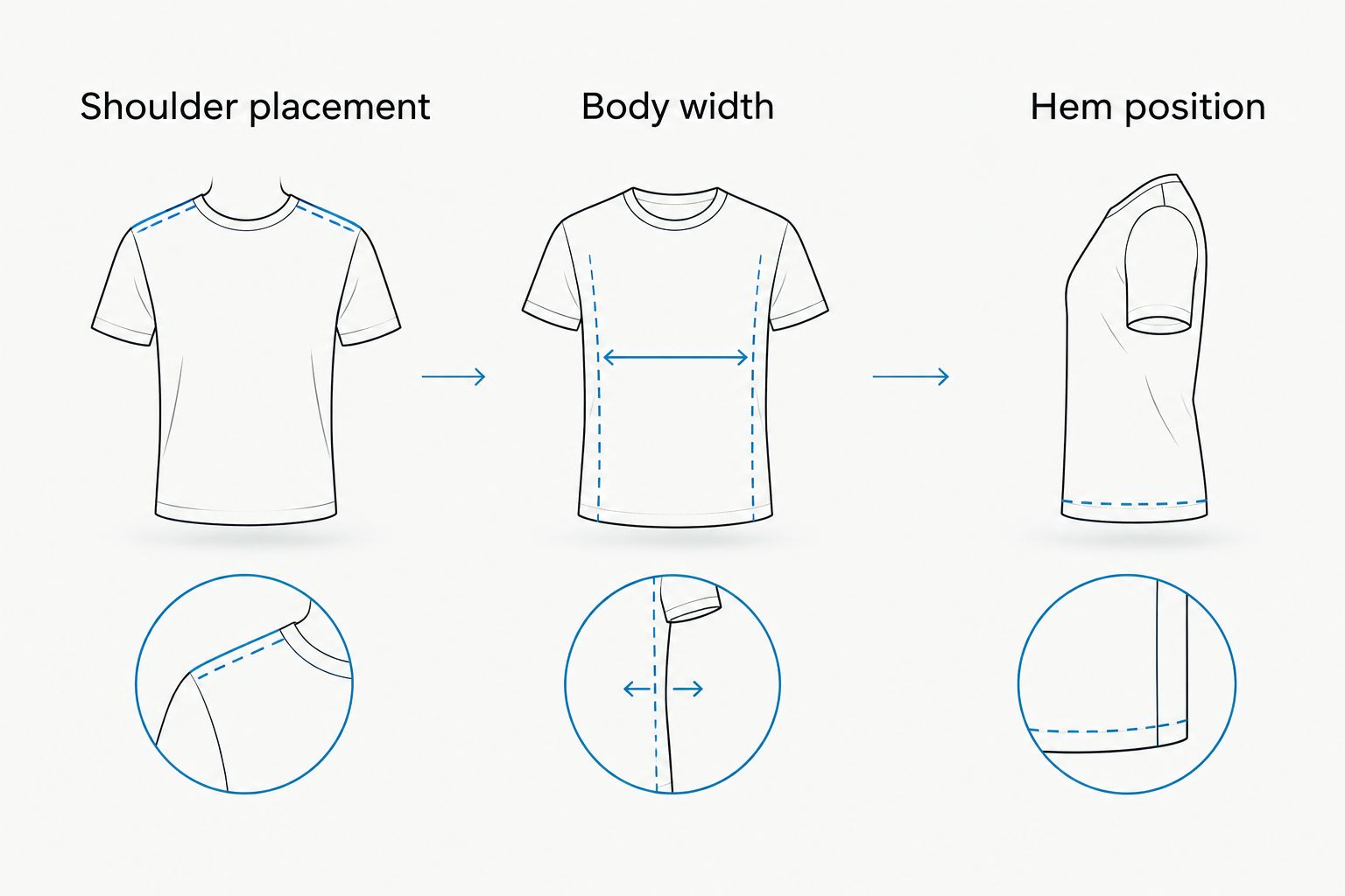
Sizing up changes more than chest room. It can change length, shoulder placement, and sleeve proportions together. If the shape you want is wide but relatively short, look for that silhouette in the garment itself rather than expecting a size change to create it.
The same method applies across men’s and women’s streetwear. Choose by your preferred outline and the garment measurements, not by an assumption about who should wear a particular fit.
FABRIC WEIGHT IS NOT A WASH DESCRIPTION
GSM means grams per square meter: a measure of fabric mass per area. It does not describe the wash, print treatment, or garment dimensions.
For example, the 7WXVES NO BUDGET™ Racing Tee description specifies 400 GSM heavyweight fabric. That figure identifies a fabric-weight specification. It does not establish that the shirt has a washed finish, and it should not be transferred to other tees in the range.
A washed tee without a listed GSM is not automatically lightweight. A heavyweight tee is not automatically faded. Keep those judgments separate when comparing descriptions in 2026.
Check the composition and care information for the particular garment. Do not substitute words such as premium, washed, or vintage for those details. A finish is a look, not a complete fabric specification.
TWO WASHED-COTTON DESIGN REFERENCES
The Water Preservation Oversized Tee and Angel Oversized Tee descriptions both explicitly identify washed cotton and an oversized, boxy fit. They are useful references for the combination discussed here—not evidence that every graphic tee shares those attributes.
| Design reference | Best for studying | Confirmed description | What the description does not establish |
|---|---|---|---|
| Water Preservation Oversized Tee | Washed cotton with a brand-logo graphic | Washed cotton, short sleeves, oversized boxy fit, 7WXVES logo | Exact wash process or fabric GSM |
| Angel Oversized Tee | Washed cotton with an angel graphic | Washed cotton, short sleeves, oversized boxy fit, angel logo | Exact wash process or fabric GSM |
The strength of both descriptions is clarity about the basic finish and silhouette. The limitation is that they do not provide every technical detail needed to compare fabric weight or treatment.
Use the photographs to evaluate the artwork. Do not assume softness, print aging, or a specific shade from the product names alone.
WHY WASHED GRAPHIC TEES LOOK DIFFERENT
Several visible elements change the result even when two shirts are both described as washed. Use these factors to explain what you like rather than relying on a broad label.
- Base color: The underlying tone affects the relationship between shirt and artwork.
- Tonal variation: An even surface and a visibly uneven surface create different levels of visual activity.
- Graphic contrast: Clear separation makes the print more prominent; close tones make it quieter.
- Graphic placement: Chest and back artwork interact differently with layers.
- Garment shape: Width, length, and sleeve proportions frame the print.
- Photograph conditions: Lighting and image treatment affect how color and surface variation appear on screen.
For an online purchase in 2026, compare the same feature across different photographs. If a fade appears strong in one image and barely visible in another, do not treat either image alone as a precise color reference.
HOW DO YOU STYLE A WASHED GRAPHIC TEE?
Give the shirt a clear role. If the print and fade are both prominent, let the trousers provide shape without adding another competing graphic. If the shirt is tonal, use the outfit’s proportions to create the distinction.
For a wide tee, judge the complete outline with your chosen trousers. Wide-leg trousers continue the volume; straighter trousers create more separation between top and bottom. Neither is a rule you have to follow—the better choice is the outline you actually want.
An open layer frames the front graphic, but also covers part of the shirt. Check that relationship rather than adding a jacket automatically.
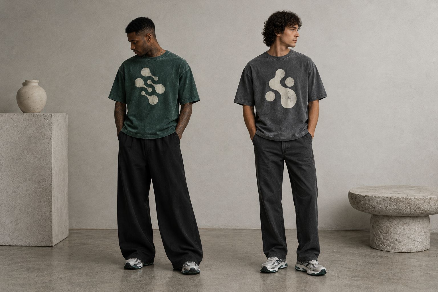
Before leaving, look at the outfit from the front and side. Check whether the hem, sleeves, and trousers create the balance you intended. That is more useful than adding accessories to solve a shape you do not like.
DOES WASHED MEAN THE GRAPHIC IS DISTRESSED?
Washed does not, by itself, establish that the graphic is distressed. The fabric finish and the print appearance need separate inspection.
Look for visible breaks or fading in the artwork, then check whether the description identifies them as part of the design. Do not assume a clear print will develop a particular aged appearance through wear.
SHOULD YOU SIZE UP FOR A WASHED GRAPHIC TEE?
Do not size up solely because a tee is washed. Use garment measurements and your preferred silhouette to choose the size.
If the shirt is already described as oversized or boxy, an additional size increase can change the outline beyond what you intended. Compare width and length before deciding.
FAQ
What should I look for in a washed graphic tee?
Look for a finish you like, readable graphic placement, and a silhouette that matches your preferred fit. Check fabric composition, garment measurements, and care instructions separately.
Is a washed graphic tee the same as a vintage tee?
A washed graphic tee is not necessarily a vintage garment. A faded appearance does not establish the shirt’s age or history.
Does washed cotton mean the shirt is heavyweight?
Washed cotton does not establish fabric weight. Look for a stated fabric-weight specification rather than using the finish as evidence.
Is a boxy fit better than sizing up?
A boxy fit is the more direct choice when you want width without relying on a size increase to create the shape. Compare the actual garment dimensions because boxy proportions differ between shirts.
Can I wear a washed graphic tee with wide-leg trousers?
Yes, a washed graphic tee can work with wide-leg trousers. Judge the combined width and hem position so the outfit has the silhouette you want.
How should I wash a washed graphic tee?
Follow the care label for the specific garment. Do not assume a washed finish makes every wash temperature, drying method, or treatment suitable.
How do I choose a washed graphic tee online in 2026?
Compare full-garment photographs, detail images, and listed measurements before choosing a washed graphic tee online in 2026. Keep visible finish, confirmed fabric details, and your fit preference separate.
ONE LAST THING
Character is not the same as damage. You do not need holes, cracked artwork, or aggressive fading to make a graphic tee feel individual. A deliberate silhouette and the right amount of contrast can carry the outfit.
Use that standard when considering 7WXVES washed graphic tees: read the specific description, inspect the whole shirt, and choose the shape you want to wear. Let the finish support your style—not make the decision for you.