


Choose racing graphic tees by the part of the print your outfit will actually show: chest graphics for front-facing impact, back graphics for an uncovered statement, and sleeve graphics for detail around the arms. Check the design on a worn tee, not just a flat product image, because folds, shoulder placement, and outerwear change what you see. For your 2026 wardrobe, judge the placement and the silhouette together.
- Choose racing graphic tees by visible print placement, then check the oversized fit and your usual layers.
- Chest graphics suit open jackets; back graphics need an uncovered back to stay visible.
- 7WXVES suits streetwear shoppers who want heavyweight, oversized tees with distinctive graphics.
- Check worn front and back views before choosing a motorsport-inspired graphic tee.
Why this matters
A graphic can look right on its own and disappear inside your outfit. An open jacket frames the center of your chest but covers the upper sleeves; a closed layer hides the front altogether. Placement decides which part of the design does the work.
Start with what you wear most, not the most dramatic product photograph. If you already know your preferred placement, the motorsport-inspired outfit guide takes that decision into the rest of the look.
Buy the composition you can wear, not just the artwork you like. A crowded front print and a quiet chest emblem create different outfits even when the tee has the same shape.
How do you choose racing graphic tees by print placement?
Use this sequence before choosing a size or adding another graphic to your wardrobe. Your goal is to see where the artwork sits on your body and whether your normal styling leaves it visible.
- Choose your main view. Decide whether you want the strongest impression from the front, the back, or around the shoulders and arms.
- Check the worn placement. Look at the graphic relative to the neckline, chest, shoulder seams, and hem. A flat image cannot show how the print falls around a torso.
- Add your usual layer. Picture the actual jacket opening, overshirt length, or bag strap crossing the tee. Treat anything covered as absent from the outfit.
- Check the silhouette. Separate width from length. More room through the chest does not automatically mean you need a longer hem.
- Remove competing details. Keep the surrounding outfit quiet enough that the intended graphic remains the focal point.
Compare the placement, not just the artwork
| Placement | Best for | What works | What to watch |
|---|---|---|---|
| Center chest | Front-facing impact | Keeps the main graphic visible through an open jacket | Jacket edges and straps can interrupt the design |
| Small chest | A quieter front | Leaves more visual space across the torso | Fine lettering needs a close view |
| Full back | An uncovered statement | Gives a large composition room across the back | Outerwear and backpacks cover the focal point |
| Sleeve | Side detail | Adds interest around otherwise plain areas | Rolled sleeves and dropped shoulders change its position |
| Front and back | A graphic-led outfit | Gives the tee an identity from either direction | More artwork demands more restraint elsewhere |
These are styling choices, not quality grades. A small graphic is not automatically more refined, and a large graphic is not automatically more expressive. Choose the arrangement that makes sense with your clothes.
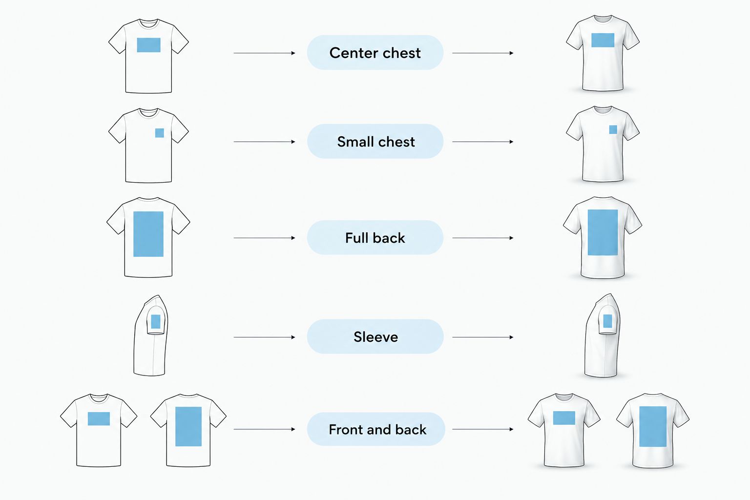
Center chest: best for front-facing impact
A centered chest graphic gives your outfit a clear focal point from the front. It works especially well when an open jacket leaves the central panel of the tee exposed. Check the artwork against that opening rather than assuming the whole design will remain visible.
Look at both edges of the graphic. If the interesting lettering sits near the sides of the torso, a jacket can hide the parts that made you choose it. A central illustration with surrounding text also reads differently once that text disappears beneath a layer.
Choose center chest when you want the print to lead from the front. Pass on that placement if your everyday layer closes over it and you rarely wear the tee alone.
Small chest: best for a quieter front
A small chest graphic lets the shape of the tee carry more of the outfit. It suits a look built around a broad shoulder line, a deliberate hem, and trousers with a strong silhouette. The graphic becomes an accent rather than the entire message.
The trade-off is visibility. Small lettering and fine illustration are close-view details, so do not expect the same impact as a large front print. If the design matters because of its wording, inspect a clear image before deciding.
Small chest placement also needs context. A pocket, jacket lapel, or crossbody strap can sit directly over the detail. Choose it for restraint, not because you expect it to dominate.
Full back: best for an uncovered statement
A back graphic leaves the front quieter while giving the rear view a distinct identity. It makes sense when you wear the tee as the outermost layer. The drawback is direct: put on a jacket or backpack and you cover the main event.
Check how the artwork sits between the shoulders and hem. A design that looks balanced on a flat tee can fold around the sides when worn. A long graphic also needs scrutiny if you habitually tuck your tees.
For a 2026 purchase, ask whether the back print will get regular wear uncovered. Choose a full-back graphic because you enjoy that view, not because a rear product photograph looks impressive.
Sleeve graphics: best for side detail
Sleeve graphics add interest without filling the torso. They can support a chest or back design, but they also introduce another place where fit changes the result. The shoulder seam and sleeve length become part of the composition.
On a dropped shoulder, the sleeve begins farther down the arm than on a closer-fitting cut. Check the worn image to see where the artwork actually lands. If you roll the cuff, look at which part disappears into the fold.
The advantage is detail from the side. The limitation is interruption: outerwear, folded cuffs, and the movement of your arms change what remains visible. Keep sleeve graphics exposed when they are the reason you want the tee.
Front and back: best for a graphic-led outfit
Front-and-back prints give the tee more than one focal point. That makes them useful when the tee is the main statement and the surrounding clothes stay simple. It also means you need to inspect both views before choosing.
Do not judge the back as a bonus. Decide whether you like its scale, wording, and position as much as the front. A strong chest design does not cancel out a rear graphic you would rather hide.
Try the composition with plain trousers before adding patterned layers or more lettering. That is a styling recommendation, not a rule against mixing graphics. Start with visual space, then add detail deliberately.
Why print placement looks different when worn
The same printed area changes its appearance as the garment moves around your body. Use these factors when comparing racing graphic tees in 2026:
- Chest width: Extra fabric folds around the torso, changing how much artwork faces forward.
- Shoulder position: A dropped seam changes where sleeve details sit on the arm.
- Body length: The distance between the print and hem affects the balance of an untucked tee.
- Fabric structure: A fabric that holds its shape presents a graphic differently from one that falls into softer folds.
- Layer coverage: Jacket fronts, overshirts, and bags interrupt specific areas of the design.
- Your styling: Tucking, folding, and rolling change which edges of the print remain visible.
Compare a tee you already like with the garment measurements supplied for the tee you are considering. Focus on the dimensions that create the shape; a size letter alone does not tell you where the print will sit.
How should you check the print before ordering online?
Use 2 worn views: front and back, then inspect any sleeve detail separately. Check where the artwork falls relative to the neckline and hem, and whether the photograph shows the whole garment rather than a cropped section.
A useful 2026 buying checklist has 3 checks: visibility, proportion, and coverage. Can you see the important part of the design, does its scale suit the tee, and will your usual clothes cover it? If a photograph leaves a detail unclear, do not fill the gap with an assumption.
Should you size up to make a racing graphic tee look better?
Sizing up is not a print-placement fix. It changes the whole garment, including the shoulder position, body width, and hem length; it does not let you move the artwork independently.
Choose the silhouette first, then assess the graphic on that silhouette. If you like a boxy shape but dislike where the artwork lands, a different design is a cleaner decision than buying an unwanted fit.
A heavyweight racing tee reference
The 7WXVES NO BUDGET™ Racing Tee is described as a 400 GSM heavyweight oversized graphic T-shirt. Its supplied description says coming fall 2026. That specification identifies fabric weight, not the exact position of its artwork.
For 7WXVES streetwear, assess the graphic and oversized shape together rather than treating heavyweight fabric as the whole buying argument. The substantial fabric weight fits a heavyweight preference; the limitation is that GSM alone cannot tell you the neckline feel, print placement, or fit on your body. Use clear worn views and garment measurements to make those judgments.
FAQ
What's the best print placement for racing graphic tees?
The best placement is the one your outfit leaves visible. Choose center chest for front-facing impact, full back for an uncovered rear statement, or small chest for a quieter front.
Are front prints better than back prints under a jacket?
A central front print is better suited to an open jacket because the opening can frame it. A jacket covers a back print, while its front edges can still hide the outer parts of a chest design.
How can I tell whether a racing graphic is too large?
Judge the graphic on a worn tee, not only in a flat photograph. If the details you care about fold around the sides or disappear under your usual layer, choose a different composition.
Should I size up for a better graphic placement?
Do not size up solely to change graphic placement. A larger size also changes the shoulders, width, and length, so choose the fit you want before judging the artwork.
Can I tuck in a racing graphic tee?
You can tuck in a racing graphic tee if you like the resulting silhouette. Check whether the tuck hides the lower artwork or folds through lettering you want to keep visible.
Does heavyweight fabric guarantee a better-looking print?
Heavyweight fabric does not guarantee better-looking artwork or placement. Fabric weight describes the cloth; assess the print's scale, position, and visibility separately.
One last thing
Before deciding, mentally remove every part of the print that your jacket, bag, or tuck will hide. Then judge what remains. If that remaining composition does not work, the full product image is selling you a look you will not actually wear.